Premiera Skincare
- Mobile-first
- UI Design
- Website
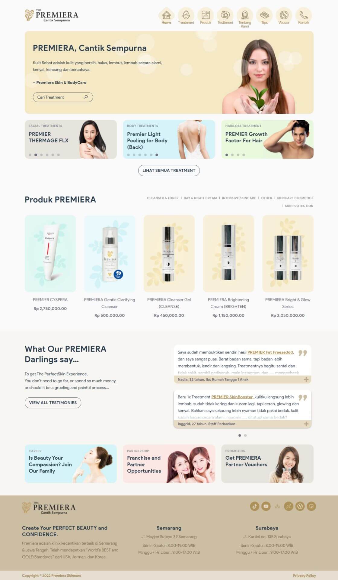
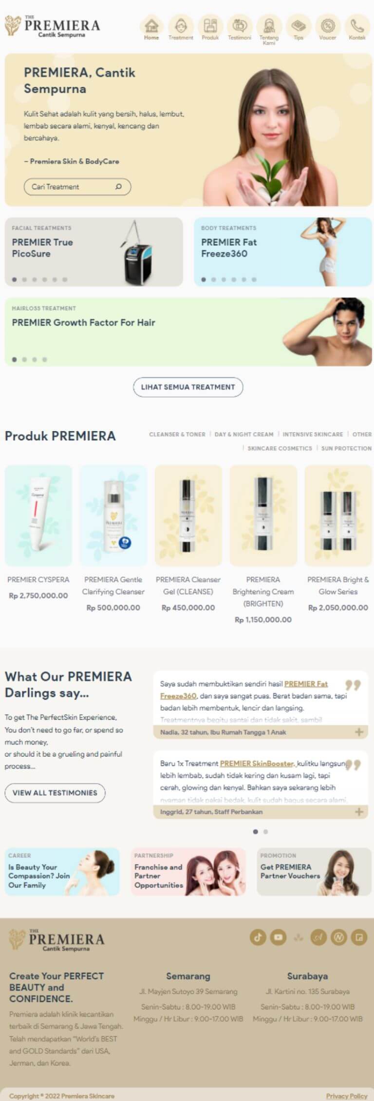
Premiera is one of the top luxurious skincare in town. Being recently rebranded, they needed a website that fits their new aesthetics.


Project Summary
Overview

With a fresh rebrand, Premiera needed to have a new online identity that fits them. situs11 Having an inviting atmosphere was paramount in their vision for their online presence.
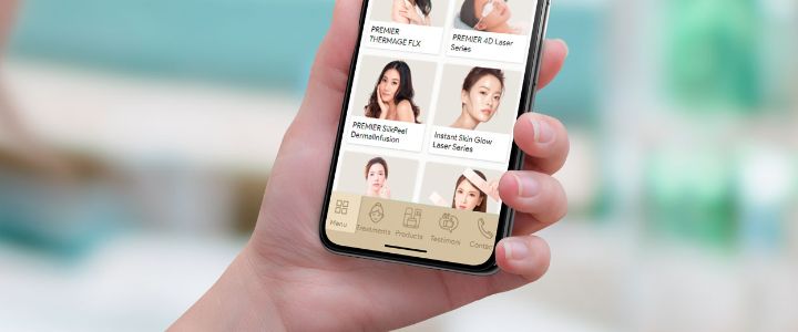
Looking at the statistic of their old website, 85% of visitors are on mobile devices. So we set the main goal for the website: Making the design approach to be mobile-first.
We enhanced the user orientation by moving the navigation at the bottom. This makes it easier to reach if you’re holding your phone with 1 hand.
Dark Mode

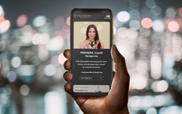
Continuing with the objective of improving mobile experiences, we added Dark Mode. All images are dimmed, the background becomes black, and the texts become lighter.
The toggle to enable this is right at the top, so visitors won’t miss it.